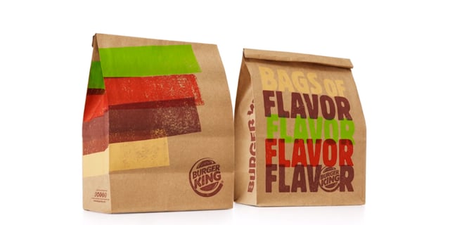
There is a trend sweeping the fast food industry, and it’s not just incorporating healthier ingredients into their menu. Rebranding and refreshing with food packaging redesign has become a key focus for many restaurants in the U.S. and beyond.
Some of the largest chains, like McDonald’s and KFC, are testing out new food packaging options to make their products more easily portable and recognizable.
Burger King is the latest fast food giant refreshing the design and graphics of its bags and containers to establish itself as a more uniform brand on a global scale. With more than 14,000 restaurants in over 100 countries around the world, it’s important for brands like Burger King to be easily identifiable no matter where customers travel.
With myriad options available, customers specifically look for the colors, logos, and graphics they associate with the companies and products they know and trust. Cohesive branding helps companies evolve for a better customer experience. It’s how brands begin building an iconic image that grabs consumers’ attention and keeps them returning to the products they love. Upgrading your food packaging design can be tricky, however, as too much change too quickly can be alarming and off-putting to customers.

Burger King’s brand refresh can teach other food manufactures important lessons in maintaining the popular designs customers know while fine-tuning its graphic and structural elements to stay current in the 21st century. BK’s new packaging design features natural, handcrafted type with a modern, minimalist color scheme. The new graphics look like they were printed from rubber stamps, giving the bags the same feel as the food packaging one would find in a smaller mom-and-pop shop. Words like “fresh” are incorporated all over this new packaging, clearly communicating to customers that BK is committed to serving quality ingredients. This is a key step in changing people’s perception about fast food as a whole.
Companies can take a cue from Burger King in their packaging designs by focusing on natural materials and simplistic graphics that retain the ability to stand out and catch people’s attention upon first glance. The key is to build that brand recognition, and the first step is choosing food packaging with high-quality structural elements that best serve as the perfect backdrop for your images and logos.
When refreshing your food packaging to help create a more uniform, cohesive brand, your company shouldn’t go at it alone. To build brand recognition, work with a trusted supplier – and a creative, forward-thinking designer – to help perfect your package and get it in the hands of customers quickly. Food packaging should be considered a key part of your brand’s marketing, and it’s an important way to get your product out to consumers across the globe.
(Image Source: http://www.thedieline.com/)

